Learning VoiceFlow in a Week
Nov 21, 2025

TLDR: I used a healthcare scenario to study how conversations behave when you design them turn by turn. Mapping the flow helped at first, but it also revealed how limiting the flowchart workflow really is. Real conversations jump context, loop back, and surface edge cases faster than a branching map can keep up. I'll soon understand how Conversational UX depends less on paths and more on patterns, safety rules, and clear behaviour models that stay stable no matter how the dialogue shifts. And how big of a gap there is in Conversational UX design.
Learning the Basics
I started with focusing on the underlying theory behind Conversational UX: how turn-taking works, how intent is modeled, how systems recover from errors, and how safety and escalation rules shape the tone of a conversation. I read some foundational research on dialogue systems, repair strategies, and human–machine turn-taking patterns. This gave me a simple structure to work with: keep language clear, follow turns, confirm meaning often, and design for moments where the user might be confused, emotional, or unsafe.
Tagging Foundational Research Papers & Blogs
Foundational Dialogue & Conversation Theory
Grice’s Cooperative Principle (1975) — Basis of conversation maxims
Sacks, Schegloff & Jefferson — “A Simplest Systematics for the Organization of Turn-Taking”
Clark & Brennan — “Grounding in Communication” (common ground theory)
Conversational Agent Design & UX
Skantze — “Error Handling in Spoken Dialogue Systems”
Luger & Sellen — “Like Having a Really Bad PA” (CHI 2016)
Følstad & Brandtzæg — “Chatbots and the New World of HCI”
LLM-Era Conversational AI
Zhang et al., “Safety in Conversational AI Systems” (2021–2024)
Google Research — “LaMDA: Dialogue Agents”
OpenAI — “Function Calling and Conversation Control”
RASA Research — “Conversation Patterns and Slot-Filling Challenges”
Healthcare-Specific
Laranjo et al. — “Conversational Agents in Health: Systematic Review”
Bickmore et al. — “Relational Agents in Health Behavior Change”
Why I Picked Caregiving Space?
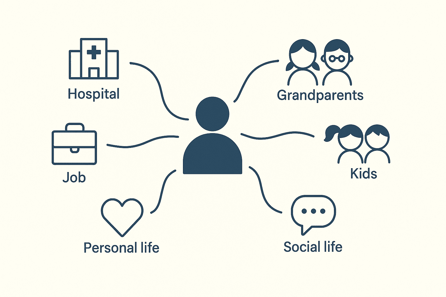
I wanted a space that showed the gaps in my thinking and pushed me to understand how conversations need to be structured. I chose the caregiving assistant because the concept was special. It exposed real design challenges. Caregivers deal with routine tasks, sudden emergencies, unclear symptoms, and constant context switching. This gave me enough variation to see how a conversation can shift in small, unexpected ways. It also made it is easier to test how the system should ask questions, confirm information, and stay safe. The idea helped me explore the structure of a conversation without treating it like a linear workflow.
Shifting From Screens to Turns
Working on this project forced me to design at the level of a single turn. There were no screens or layouts to fall back on, so every turn had to carry intent, clarify meaning, or reduce uncertainty on its own. This shifted how I thought about the interaction. I started with planning a sequence but slowly I was defining the system’s behaviour: how it asks, how it verifies, how it escalates, and how it stays safe when the caregiver’s input is vague or incomplete. Once I focused on turn quality instead of flow length, the structure became clearer and more predictable.
Working With Emotional and Safety Boundaries
It was just impossible to ignore the emotional and safety constraints when I was dealing with healthcare. Every question had weight, and every turn carried risk if phrased poorly. I had to design the conversation so it stayed calm, clear, and predictable even when the caregiver was stressed or unsure. This meant setting strict safety behaviours: verify often, avoid assumptions, signal uncertainty, and escalate when needed. This balance shaped the entire structure.
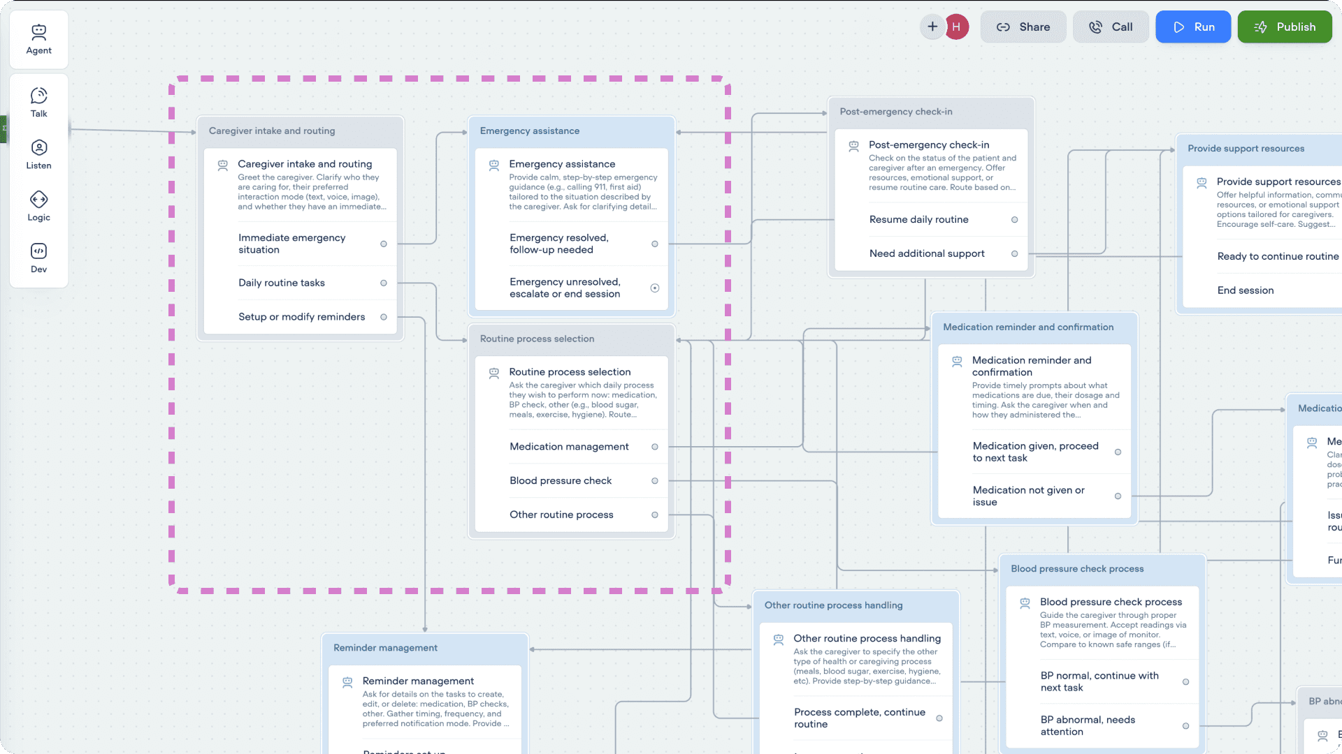
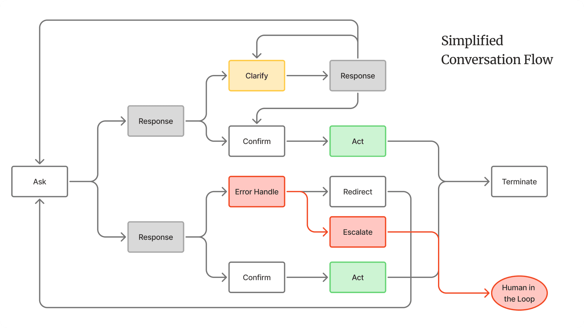
Where Flowcharts Start Breaking Down
Once the flow grew, the limits became obvious. Conversations don’t stay linear, and real users don’t follow the branching paths we draw. They jump context, bring up unrelated details, or circle back to something they said earlier. A flowchart can’t hold that kind of movement without collapsing into noise. I found myself adding more branches, not because they improved the experience, but because the diagram needed them to stay coherent. That’s when the structure stopped helping. Flowcharts are good for mapping logic, but they struggle with ambiguity, repetition, and emotional detours—things that show up in almost every real conversation.
What Actually Works: Patterns Over Paths
When the flowchart stopped being useful, I shifted my focus to the patterns that shape the conversation, not the branches that try to predict it. These patterns acted like the “design system” of the assistant, small behaviours that stayed consistent no matter where the user entered the conversation or how much context they skipped. A few patterns stood out as essential:
1. Clarify Before You Guess
People rarely give full information in one turn. A reliable clarify pattern (“Let me make sure I understood…”) prevented the system from acting on weak or vague input.
2. Confirm Decisions Explicitly
Simple confirmation turns reduced errors in high-stakes moments. It also made the assistant’s behaviour more transparent and easier for the user to trust.
3. Summarize When Context Gets Heavy
Summaries worked the same way they do in real clinical communication: they reset the mental model. It helped the user feel grounded and helped the system avoid drift.
4. Escalate Predictably
Escalation logic had to be clear and repeatable. Whenever a safety rule triggered, the assistant needed a consistent way to move the user out of conversation mode and into action.
5. Reset the Thread When Needed
Some turns required a soft reset, step back, surface the key information, and reopen the conversation. This prevented the flow from spiralling into confusion when the user changed direction suddenly.
These patterns held the conversation together much better than a large branching map. They gave the assistant a steady “behaviour layer” that could handle context switches, emotional variation, and incomplete information without needing a separate path for every situation.
Powerful tech shouldn’t feel heavy. I shape AI and data into simple, human patterns. I design for outcomes that matter. Less friction, clearer decisions, more confidence